Suppose that we have a data set with a large number of features. Which features are most relevant for determining some sort of classification? Passing from many features to a few is a dimensional reduction similar to what we used in our DMRG (density matrix renormalization) study of spin-chains. PCA (principal component analysis) is the standard method of statistical dimensional reduction. It is a nice application of the SVD decomposition of a matrix (made from our feature array).
 Call the feature matrix
  , which will have
  rows and columns, is the number of features (this is the transpose of the dataframe to matrix loading of a typical data file in which the column labels are the features). Find the mean of each row
![\[\bar{\mathbf{x}_i}=\tfrac{1}{n}\sum_{j=1}^nx_{i,j}=\tfrac{1}{n}\sum_{j=1}^n\mathbf{x}_{j}\]](http://abadonna.physics.wisc.edu/wp-content/ql-cache/quicklatex.com-f4375b67dc70b568b68a0fd998e06f7c_l3.png "Rendered by QuickLaTeX.com")
of each row (which are  dimensional vectors), and construct the covariance matrix
![\[M={1\over n}\sum_{j=1}^n (\mathbf{x}_j-\bar{\mathbf{x}_j})(\mathbf{x}_j-\bar{\mathbf{x}_j})^T\]](http://abadonna.physics.wisc.edu/wp-content/ql-cache/quicklatex.com-bf38326ceafaaaa2d803a01803f3c389_l3.png "Rendered by QuickLaTeX.com")
This is an  matrix.
Construct its SVD decompostion  ,
,  is ,
is ,  is
is  and
and  is
is 
Select the  largest values and the corresponding vectors
  assembled into a projection matrix
 ![P_k=[v_1,v_2,\cdots, v_k]](http://abadonna.physics.wisc.edu/wp-content/ql-cache/quicklatex.com-741991353763e8c45c91cd22656f5c2b_l3.png "Rendered by QuickLaTeX.com") and create the dimensionally reduced data matrix
and create the dimensionally reduced data matrix
![\[y=P_k^T x\]](http://abadonna.physics.wisc.edu/wp-content/ql-cache/quicklatex.com-da336afbf60fbff1de18f88ffbe645cf_l3.png "Rendered by QuickLaTeX.com")
This of course muddies the nice descriptions of the meanings of the new features, but will reveal structures and patterns, and enable easier visualization. If  then
then  and
and  is simply a rotated version of the original data array.
PCA dimensional reductions can fail to reproduce the original data from the projections if the original data is not linearly distributed. PCA is motivated by the physical concept of principle moments of inertia, which are nice and simple when a body is ellipsoidal and rather nasty when the body is twisted and has few if any linear mass distribution axes.
PCA uses an orthogonal transformation to convert a set of correlated variables into a set of uncorrelated variables. This is in analogy to the moment of inertia matrix, which may have off-diagonal elements in an arbitrary frame but is diagonal in the principle axis frame.
PCA is just linear algebra. We can use the SVD code that I posted previously, or in R, julia, or python use PCA and SVD functions provided by loadable libraries.
Let’s start with the julia PCA fit functions in the MultivariateStats package…
Example We will use PCA to visualize a high-dimension dataset. This is a 329 city quality of life rating published in “Places Rated Almanac”, by Richard Boyer and David Savageau, which you can find online via Google because it is a popular dataset for ML exercises.
using DelimitedFiles,DataFrames,StatsPlots
dat=open(readdlm,"/home/jrs/Downloads/places.txt")
# note that I make this into the array PCA expects, and transpose it
dat1=Array(dat[2:329,2:10]')
# and make it into a float64 array
dat1=float.(dat1)
# load into a dataframe too
df=DataFrame(dat)
rename!(df,:x2 => :Climate)
rename!(df,:x3 => :HousingCost)
rename!(df,:x4 => :Hlthcare)
rename!(df,:x5 => :Crime)
rename!(df,:x6 => :Transp)
rename!(df,:x7 => :Educ)
rename!(df,:x8 => :Arts)
rename!(df,:x9 => :Recreat)
rename!(df,:x10 => :Econ)
delete!(df,1)
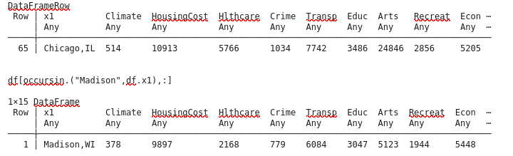
df[65,:]
Let’s look at the raw data and correlation matrix:
@df df boxplot(df.HousingCost,label="HousingCost")
@df df boxplot!(df.Hlthcare,label="Hlthcare")
@df df boxplot!(df.Crime,label="Crime")
@df df boxplot!(df.Econ,label="Econ")
@df df boxplot!(df.Transp,label="Transp")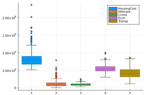
The PCA fit function wants the features as row labels and data points as columns, but the Statistics Cor function wants the data points to be rows and columns the features. Go figure…
cor(dat1')
9×9 Matrix{Float64}:
  1.0        0.386855  0.215424   0.191523   0.0810255  …  0.228382   0.216068   -0.0988771
  0.386855   1.0       0.453103   0.134675   0.271748      0.448492   0.422472    0.269227
  0.215424   0.453103  1.0        0.307089   0.46875       0.86567    0.323104    0.0671519
  0.191523   0.134675  0.307089   1.0        0.289034      0.391178   0.34767     0.26181
  0.0810255  0.271748  0.46875    0.289034   1.0           0.463825   0.362504    0.0570545
  0.0670749  0.197678  0.488307   0.0771594  0.333349   …  0.371872   0.0734701   0.116997
  0.228382   0.448492  0.86567    0.391178   0.463825      1.0        0.377375    0.0742588
  0.216068   0.422472  0.323104   0.34767    0.362504      0.377375   1.0         0.171337
 -0.0988771  0.269227  0.0671519  0.26181    0.0570545     0.0742588  0.171337    1.0

# some correlations run as high as 0.86. The PCA redefined features will be uncorrelated
Next we run the PCA fit routine in MultivariateStats on the normalized, transposed array dat1
M=fit(PCA, dat1; maxoutdim=9)
# PCA(indim = 8, outdim = 3, principalratio = 0.9710482934814157
# this will be the trasformed (principal) features array
dat1t = MultivariateStats.transform(M, dat1)
# we plot the principal component #1 versus principal component #2
h = plot(dat1t[1,:], dat1t[2,:], seriestype=:scatter, label="")
plot!(xlabel="PC1", ylabel="PC2", framestyle=:box)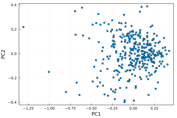
Let’s figure out who these outliers are…remember that I trimmed the first row of labels off of the dat dataframe
lab=[j for j in 1:328]
annotate!.(dat1t[1,:].+0.04, dat1t[2,:].-0.05, text.(lab, :red, :left,8))
h
dat[213+1,1]
"New-York,NY"
dat[314+1,1]
"Washington,DC-MD-VA"
dat[65+1,1]
"Chicago,IL"
dat[179+1,1]
"Los-Angeles,Long-Beach,CA"
dat[234+1,1]
"Philadelphia,PA-NJ"
# and add the feature axes onto the plot
proj = projection(M)
for i=1:9; plot!([0,proj[i,1]], [0,proj[i,2]], arrow=true, label=dat[1,i], legend=:topleft); end
display(h)
StatsPlots.savefig(h,"PCA2.png")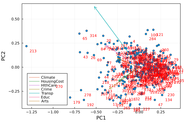
Next we make a scree plot to figure out how much of the variance is captured by each principal component. The singular values/eigenvalues are accessed with principalvars(M) , which we convert to percentages and plot versus component label.
principalvars(M) .* 100 ./ sum(principalvars(M))
8-element Vector{Float64}:
 39.72556062366986
 14.633117823400234
 12.458887316319753
 11.059336203326499
  8.973157190367738
  7.014696807854591
  3.578916631390473
  2.5563274036708585
# almost 40% of the data variance is encapsulated in the first principal component.
h=plot([j for j in 1:8],principalvars(M),xlabel="Component",ylabel="% variance",label="",seriestype=:bar)
StatsPlots.savefig(h,"PCA3.png")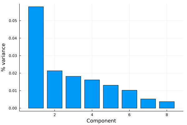
We used PCA to visualize high-dimensional data, it can be used to classify data or look for patterns in data as well